2024 · SaaS landing page
Restaurant Website Redesign
A concept landing page for a fine dining restaurant, leaning on appetite-driven photography, warm editorial typography, and a calm navy palette.
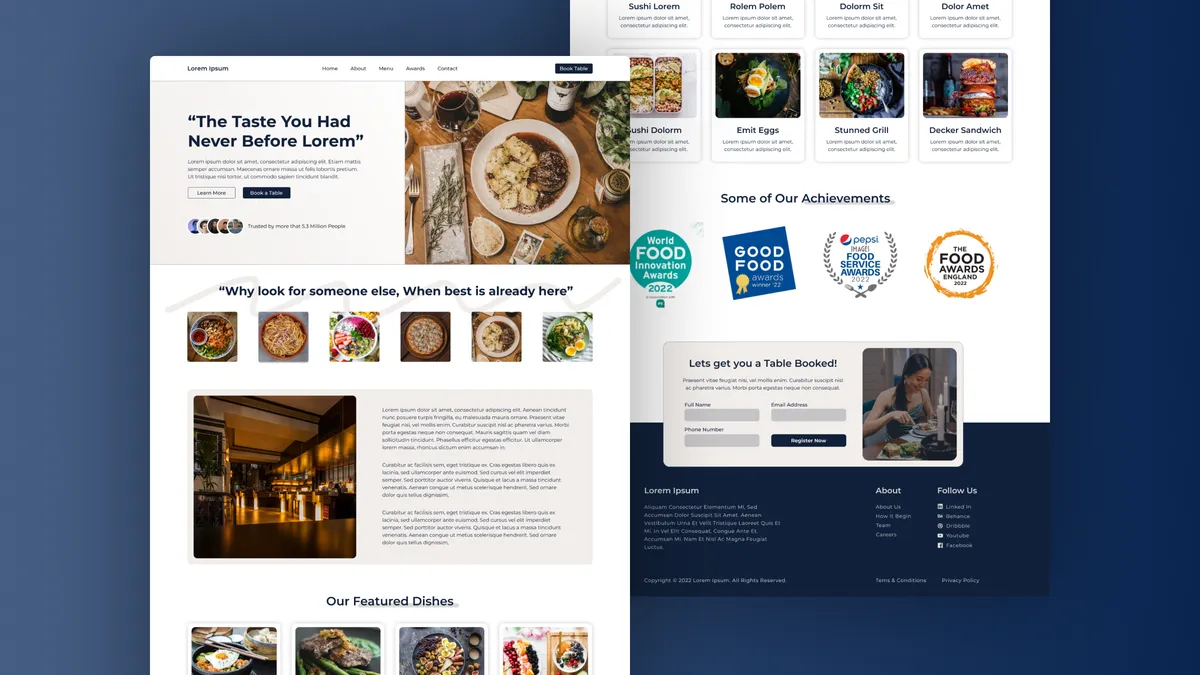
Overview
I designed this as a concept piece around a fictional fine dining brand, Gourmet Haven, to practice marketing layouts that lead with photography rather than copy. The hero pairs an oversized editorial headline, “The Taste You Had Never Before,” with a top-down hero shot of a plated dish on rustic wood. Below that, a circular cuisine selector, a story block with interior imagery, a featured dishes grid, an awards row, and a small reservation card stack into a single scroll. The whole sheet sits on a deep navy backdrop so the cards float like printed menu pages.
Context
Most restaurant sites I had seen at the time were either overbuilt CMS templates or skeumorphic chalkboard themes. I wanted to see what a quieter, more editorial direction looked like — closer to a food magazine spread than a booking funnel. I treated it as a self-directed exercise: invent a brand with a clear personality (warm, considered, slightly upscale), then design a single landing page that could plausibly sit alongside a real reservation flow. No client, no analytics targets — just a chance to push composition and food photography without negotiating it away.
Problem
A restaurant landing has to do two contradictory things in one screen: make you hungry and make you book. Lean too hard on imagery and the conversion path disappears; lean too hard on the booking widget and it feels like an airline site. The brief I gave myself was to keep the page mouth-watering at every scroll position while still surfacing the dish menu, credibility (awards), and a table reservation form. The page also needed to feel handmade rather than templated — most of my reference sites used the same three stock layouts, and I wanted to avoid that.
Approach
I started in Figma with a moodboard of food magazines and worked outward from the hero plate. The headline uses a serif at near-display size to set an editorial tone, and the body settles into a clean sans for legibility. I leaned on circular dish thumbnails for the cuisine selector to break up the rectangular rhythm of the cards below. The awards row uses three real-looking badges centered against white to act as a trust break before the reservation card. Everything sits on a single navy canvas with white content cards, which kept the visual hierarchy obvious without needing dividers or heavy borders.
Outcome
The deliverable was the landing page comp shown here plus a short component inventory I could reuse on future hospitality concepts — card, badge row, circular selector, reservation form. It is not in production for a real restaurant; the value was in the practice. The piece performed well on Dribbble and a couple of recruiters referenced it when reaching out, which told me the editorial direction was reading the way I intended. I also kept the Figma file structured cleanly enough that I have pulled the dish-grid pattern into two later concepts without rebuilding it.
Lessons
- Anchor a food page on one hero shot and let everything else play support.
- Use shape contrast (circles inside a grid of rectangles) to break template feel.
- Keep credibility blocks like awards short — three badges read stronger than six.
- Design the reservation card as a calm pause, not a loud CTA, when the rest of the page is already doing the selling.
- Build a small reusable component set even on concept work; it pays back on the next exercise.