2024 · SaaS landing page
Photographer Portfolio
An opening-soon page for a portrait photographer pairing a soft editorial layout with a moody contact-sheet grid to tease the full portfolio.
Overview
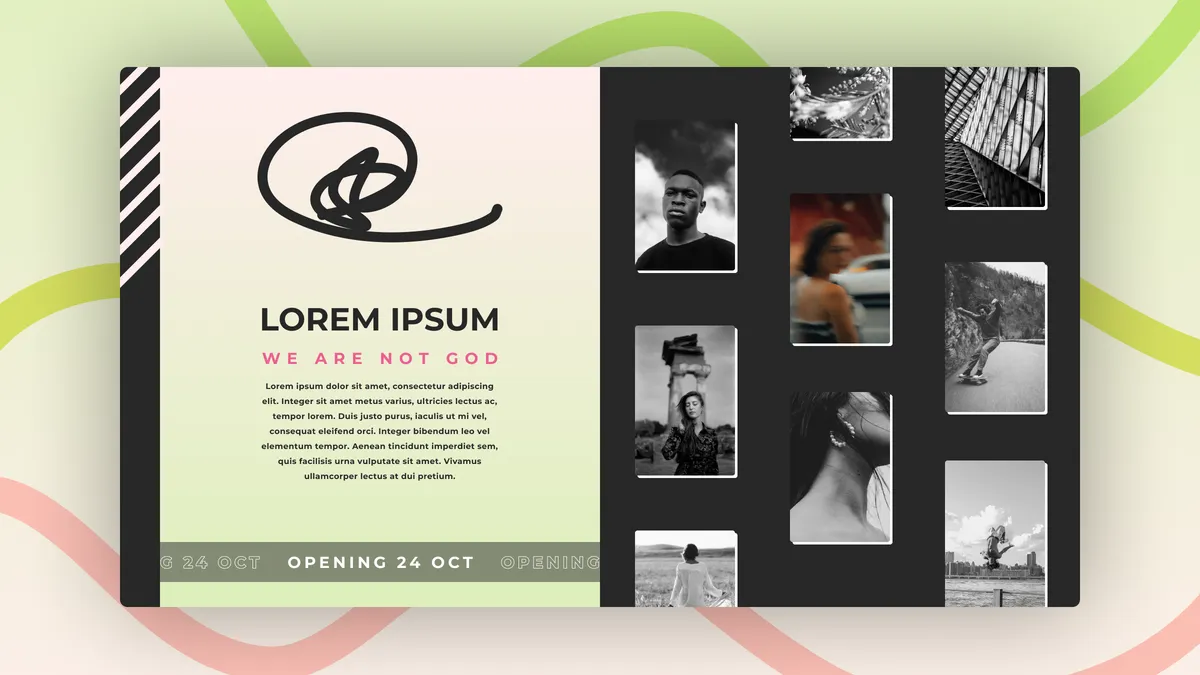
A self-directed concept for an “Opening 24 Oct” teaser page belonging to a fictional portrait photographer. The composition splits the screen into two moods: a warm cream panel carrying the wordmark, a hand-drawn signature loop and a short manifesto in coral, alongside a charcoal contact-sheet wall of black-and-white portraits. A thin diagonal stripe and a looping marquee anchor the bottom edge. The exercise was about restraint, about treating a launch page as the first frame of a body of work rather than a placeholder full of countdown timers and subscribe-now noise.
Context
I wanted to push back on the default “coming soon” template, the centred logo on a dark gradient with an email field underneath. Photographers live or die by sequencing, so the brief I gave myself was to design an opening shot that already feels curated. Visually I leaned on editorial print references, asymmetric grids, generous serif type for the wordmark, a coral accent borrowed from darkroom safelight, and pastel ribbon shapes in the background to soften the hard rectangle of the card and hint at movement.
Problem
Teaser pages have a thin job description and a wide failure mode. Say too little and visitors bounce; say too much and you spoil the launch. The harder constraint is tonal, the page has to introduce a personal aesthetic in one screen without showing the actual portfolio. I also wanted the contact-sheet grid to read as intentional curation, not stock filler, which meant the layout had to survive at different aspect ratios and the typography had to do most of the emotional work while the imagery stayed deliberately monochrome.
Approach
I built the page around a single card floating on a pastel field, which keeps focus and lets the background ribbons breathe. The left column carries identity, mark, name, tagline, paragraph, while the right column is a four-by-two portrait grid in greyscale so nothing competes with the coral accent. The “OPENING 24 OCT” marquee runs along the card’s lower edge as a quiet animation cue. In code I prototyped it with Next.js and Tailwind, using Framer Motion for the marquee loop and a gentle parallax on the ribbon shapes when the cursor moves.
Outcome
The result is a launch page that behaves more like a magazine cover than a holding screen. The greyscale grid sets expectations for the photographer’s range, portraits, street, landscape, while the coral “WE ARE NOT GOD” line gives the brand a point of view before a single full image loads. As a portfolio exercise it gave me a reusable pattern for any creative who needs an interim site, a card-on-canvas layout that scales from teaser to full landing page just by swapping the right-hand grid for live content.
Lessons
- Treat the teaser as the first slide of the portfolio, not a separate artefact.
- Lock imagery to one treatment (here, monochrome) so accent colour can carry mood.
- Anchor an asymmetric layout with a single floating card to keep focus on mobile.
- Use motion sparingly, a marquee and a ribbon parallax were enough to feel alive.
- Write the manifesto copy early, the layout has to be sized around the words.